"Explore SEL is a product of the Taxonomy Project, which is an EASEL Lab project designed to create a scientifically-grounded system for organizing, describing, and connecting frameworks and skills across the “non-academic” domain."
Read more about Harvard EASEL Lab →Amanda Yeh was the previous UI/UX intern who worked on this website and data visualization tool. She generated 50 survey questions that asked educators how their current experience, pain points, and the selection process on SEL frameworks. In the end, a written
survey of 20 questions was given to educators, policymakers, and researchers in the field.
Through this survey, she found that:
1. Target users are
familiar with one or a few frameworks but thought more knowledge on SEL, in general, could benefit their work.
2. Users thought the most beneficial information would be
framework comparison, followed by framework profiles, followed by SEL terminology.
Check out her research report →INFOGRAPHIC #1
Frameworks focus on different things – some cover many areas of SEL and the non-academic domain while others take a more focused approach. This can make it difficult to determine which frameworks meet your needs or identify those that can be paired to create alignment between ages and across settings. The bar graphs below compares the extent to which each framework concentrates on six common areas, or domains, of SEL.
✌ INTERACT WITH INFOGRAPHIC →
INFOGRAPHIC #2
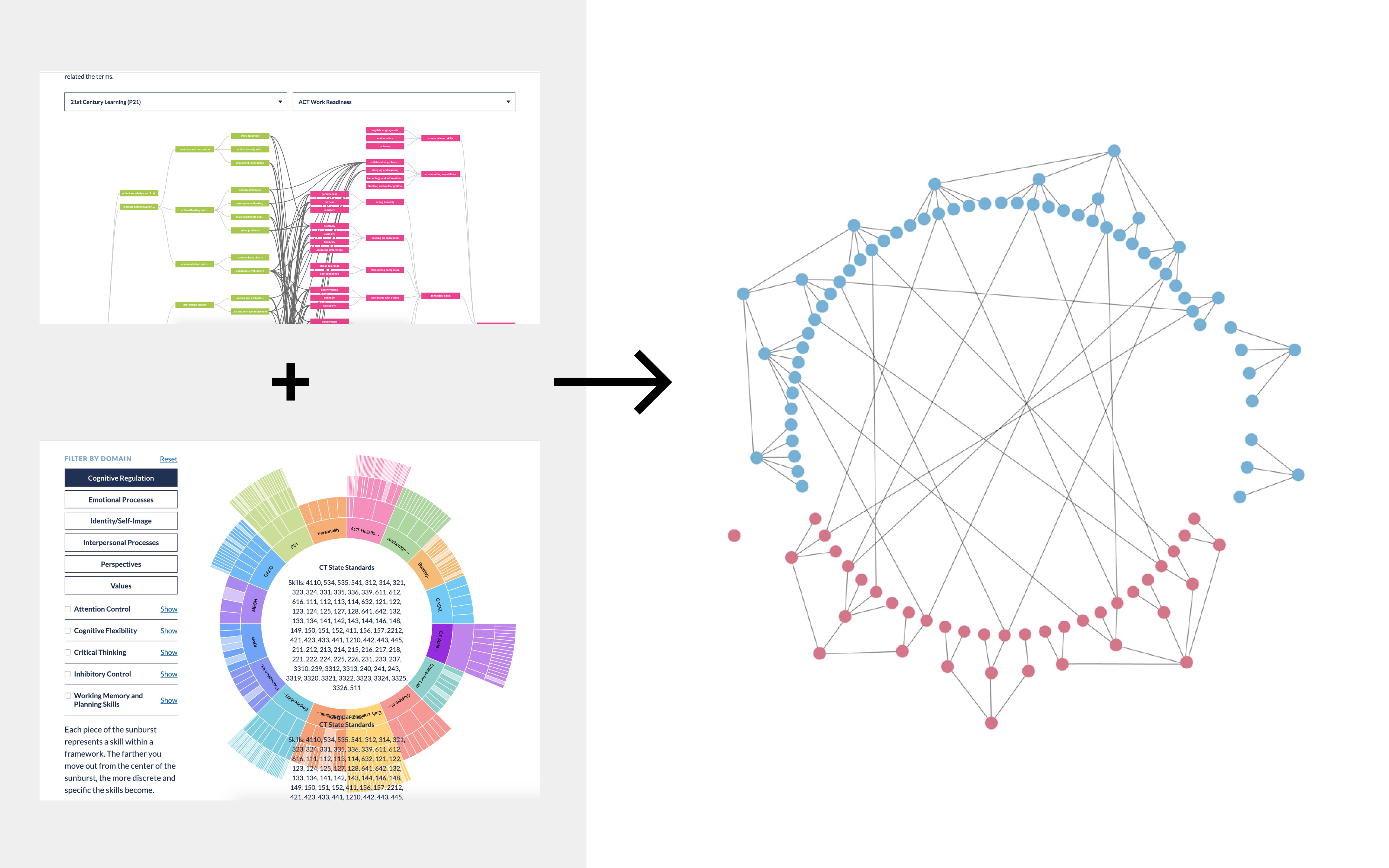
Frameworks label skills very differently. It can be difficult to figure out where inside a framework the skill you are interested in lives – especially if it is labeled or grouped under an unfamiliar name.Use the sunburst diagram below to see where a particular skill appears across frameworks.
Users can click on a skill in the sunburst or select from a list of 100+ common skills to highlight related skills across frameworks.
✌ INTERACT WITH INFOGRAPHIC →
INFOGRAPHIC #3
Different frameworks might refer to the same or similar skills using different names, or call two very different skills by the same name. This makes it hard to tell whether or not frameworks are addressing similar skills.
Users can select a framework from each list to see where terms in the left framework are related to terms in the right one – based on their definitions rather than their names. The thicker the line, the more related the terms.
✌ INTERACT WITH INFOGRAPHIC →
After ~1 year of the launch, our users told us that although the framework was useful and gave them the information they needed, it was hard to use and the learning curve is steep. They ended up using becoming familiar with only 1 of the tool (out of the 3) because of the adapting to each tool was a hassle.
Harvard EASEL Lab wanted to improve usability and visuals of these their current tools. We wanted our improvements to specifically be:
1. Can we create a system that can display all of the current infographics into one, robust visualization?
2. The new and improved tool shouldn't require so much interaction from the user to deliver the desired result.
3. Improve overall legibility.
Before diving into there-design, I identified user chokepoints and visual irritant in the existing infographics.
I kept the core interaction and layout, but I tweaked the visuals:
1. Instead of stacked bar, I changed it to bubbles sitting on the same x & y axis
2. Colors are more grounded (less saturated and darker shade value)
3. Buttons have a clearer visual hierarchy
4. Users can now select and toggle frameworks


We explored different types of visualization tool, improving the design from each iteration. We realized that it is almost impossible to create a visual system that can replace all of the tools into one perfect system. Instead of striving for perfection, we started thinking more about the hierarchy of how we presented the information.
y understanding what information is vital and secondary to the user, we can present information more effectively and legibly by prioritizing important information in a hierarchal system. Information that holds a primary significance should be accessible with little-to-no interaction while minute details should feel secondary through design. This could mean smaller type, less contrast in color or shade, toggle that shows hidden details, or a filter system that allows the user to pick their desired information.
✌ VIEW SITE →